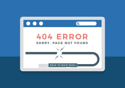
A 404 error page is a standard response code in HTTP telling the user, in effect, that they’ve clicked on a broken link and that the page they are trying to reach does not exist. You can imagine how frustrating it would feel like as a user to suddenly reach an empty page. Also, not to mention that it can prove to be one of the worst ways to lose your user/visitors.
No matter how much you try some customers invariably will end up
Not anymore! Professional web design has taken up the challenge of designing customized 404 pages that use creativity and unique UX design to transform a major convenience to a pleasant surprise.
Here are some designs to inspire you:
1) FlippingBook
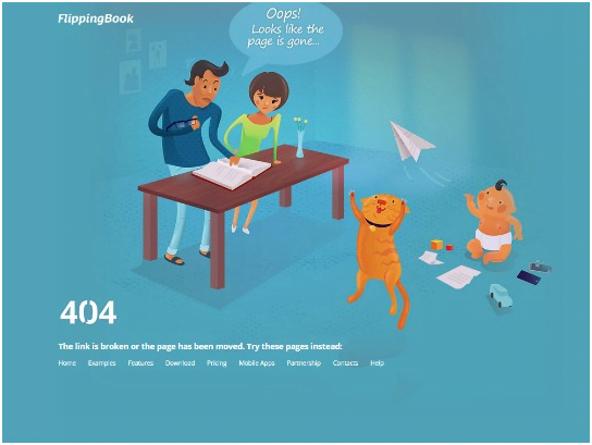
Simple wordplay is used in the message that is perfectly woven around the concept of a married couple that lost a page from a book in a chaotic household. It also resonates with the name of the website which is FlippingBook. The design also provides a number of options to enter into the main website.
2) Lego
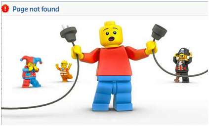
This cute little tableau for its website’s 404 page proves that you don’t need a lot of technical jargon to get your error message across.
3) Emirates
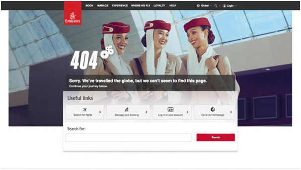
Emirates 404 error page merges in beautifully with the rest of its website, efficiently narrating its brand voice while providing ample options to get back on track with ease.
4) Repair Pal
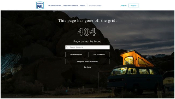
US auto repair company Repair Pal provides large buttons and a search box to help users to find the content they need nice and quickly. The nighttime van photograph helps to relate back to the automotive nature of the site. The text ‘Off The Grid,’ swiftly points out to being out in the wilderness of their website
5) eHarmony
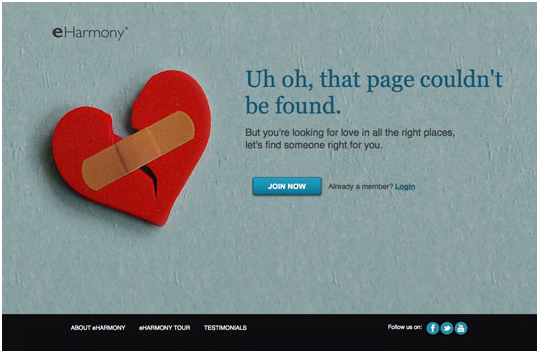
EHarmony, a popular dating site softens your blow of not finding your page with this adorable image and message that suggests that you sign up for its dating service. It works very well with its overall theme.