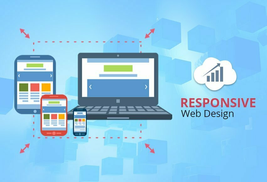
With the increasing use of mobile devices from Smartphones to tablets, to accomplish every task from checking emails to browsing social media websites to doing online shopping, one thing is obvious that mobile devices are taking over Internet surfing. As more people are beginning to use mobile devices, it is clear that today’s business cannot underestimate the importance of responsive web design.
What is Responsive Web Design?
A responsive design is simply constructing the site in the manner so that all of its structure, including content and image remains constant on any device – from desktop to mobile phone to tablets. It provides an optimal viewing experience with easy navigation and easy reading with little need to pan, scroll, or resize content across all devices.
But it is just not about resizing the website to fit the mobile screen- it is about designing optimal user experience making your content easy to read and share.
What does Google feel about responsive web design?
Google emphasizes on responsive design when designing a website, which is enough for the world to jump on the bandwagon and make sure that all their websites are responsive. Giving them their due, Google is indisputably interested in making the user’s experience worthwhile. In a recent move, Google declared to include mobile friendless as a ranking signal which will have a significant impact on the search results.
Why does Google love Responsive design?
Prior to responsive design, Googlebot needed to crawl and index separate additional website versions. With mobile design, it is easier for Google to analyze website content, as responsive design automatically loads on the same URL and webmasters can translate and retain the content on the same URL, thus eliminating the need to crawl twice and retain separate versions of the same site. Having a responsive design increases your ranking – thus achieving the core objective of SEO.
Key characteristic of Responsive design
One website, One URL
Googlebot needs to crawl websites and index all the data and content available. Responsive design has the same URL for both its desktop and mobile devices, thus making the job of Google much easier. When a website has both desktop and mobile versions, it will create different URLs and different HTML for the same site, forcing Google to index several versions of the same exact content. Google does not carry the data collected from the original website pages to their mobile versions, which proves to be a drawback when taking into account social shares and backlinks. With the responsive design, you can eliminate such problems, as you do not need distinct optimization campaigns for different devices.
Also, users find it easier to share and engage with the content that is similar across all the devices, and Google loves that as it makes users happy, and ultimately makes it easier for Google to rank websites.
Enhancing the user experience
A responsive design is all about uplifting the user experience. It presents the content in a well-designed way without compromising on any of the content. When users do not have to fidget around shrinking the text or zooming the images to read your content (because your content automatically adjusts to the screen size of whatever the device user is using) it keeps your users on your page. When a user comes to your mobile website, and get frustrated reading your content, he/she will not think twice before leaving your website and heading elsewhere for a better experience.
With more people sharing content across different devices, a well-designed and a well-constructed responsive design allows your users to have a similar experience on both mobile devices and desktop while viewing the same content.
Avoid common mistakes on mobile websites
The Google algorithm gives preference to indexed web pages of mobile-friendly sites. However, Google also lists down a few handy tips to avoid compromising the integrity of your website and increase your user’s overall experience:
- JavaScript, CSS, and Image files: Make sure that Googlebot can crawl these assets because it directly affects the algorithms of your web pages and if not made effective, it can result in average rankings.
- Flash-based content and other media players: Content of flash players or other multimedia player are sometimes not supported on mobile devices. Unplayable content on any website can increase the frustration for viewers.
- Relevant links: If your website consists of distinct mobile URLs, you WebPages must direct mobile users on each desktop URL to its suitable mobile URL. It is extremely incorrect to redirect users to other pages such as the homepage.
- Slow mobile pages: It is crucial that your mobile site loads as quickly as possible. It can be a frustrating experience for the users if they have to wait for a long time to visualize your content.
- Visual elements: It is important that your website is not only visually appealing, but also touch-friendly. When touch elements are too close, it can make it difficult to tap relevant options. Also, it is critical that font sizes are not too small or not too large, requiring the users to zoom in or out in order to read the content.
With staggering statistics displaying the high rise of Internet users using their web-enabled mobile devices, responsive design has become one the most important facet of today’s smart marketing strategy.
Stay ahead of the competition and engage your users across all devices . Let us help you design an appealing mobile experience for your valuable users. Contact us today !